Assessment drawINgs
For these drawings I drew a shoe, a person, a city, and my hand. I shaded each one to add value to the pictures and make them look more realistic with shadows. I don’t like drawing people or cities so that was very challenging for me, but the hand and shoe were easier. It’s easier to draw an object that is still. Overall I think the shoe was the most fun to draw, while the person was the least fun.
Pencil value chart
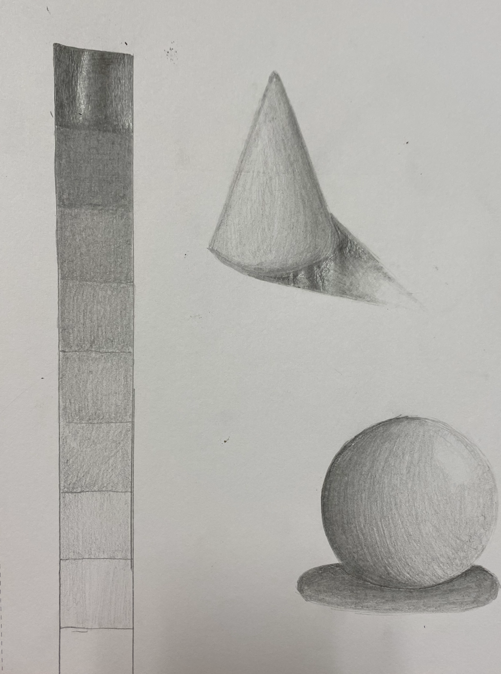
For this chart I used a number 2 pencil. I shaded the darkest square first, and slowly went down in value. I also shaded a sphere and cone. I used different values to show where the light was hitting.
Pen value chart
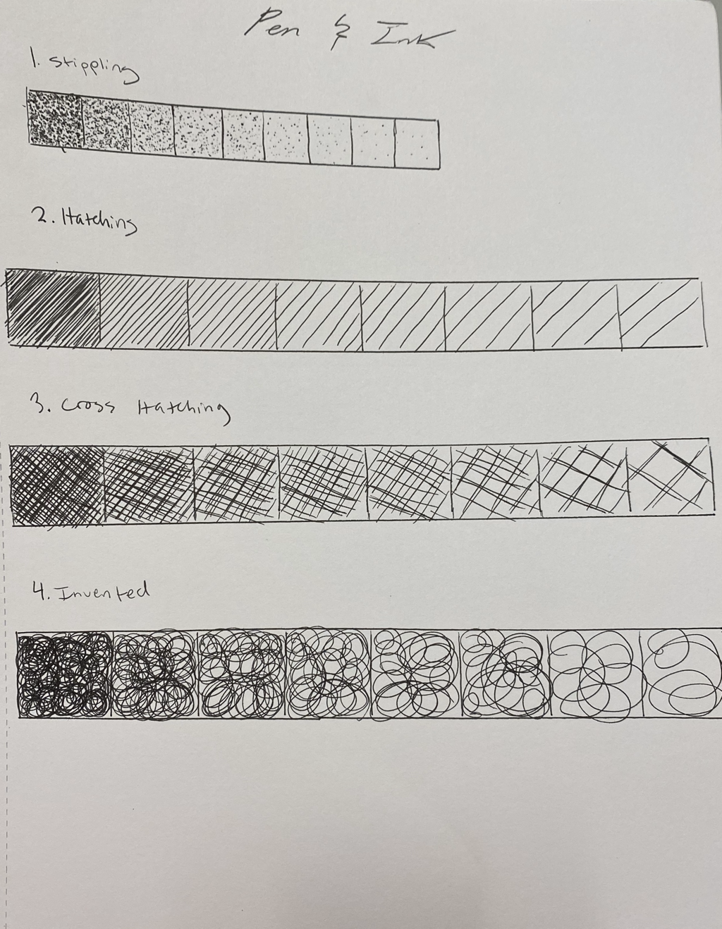
This is my pen value chart. I used stippling, hatching, cross-hatching, and invented. Hatching is my favorite while stippling was my least favorite. Invented was the easiest to draw, while stippling was the hardest because it took so long. It was hard not making tails on the dots.
Value drawing of shapes
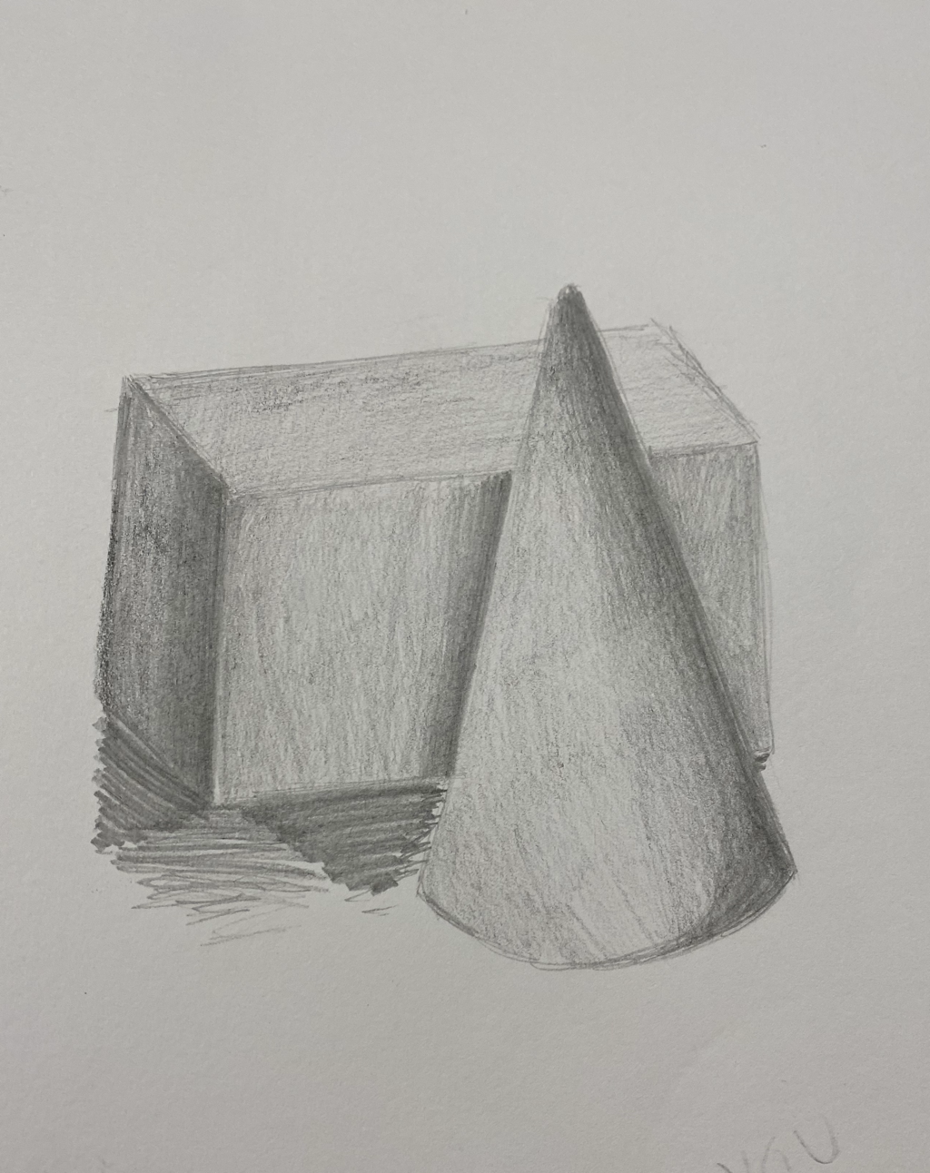
This is my perspective drawing of a cone and rectangle. I shaded the dark areas where there was a shadow and gradually got lighter in color. The cone was harder to shade than the rectangle.
Perspective drawingS
These are all of my drawings of perspective. I drew buildings, letters, and boxes. One point perspective was easiest for me while three point was the hardest. Birds eye perspective was fun to draw, while the letters were my least favorite. It was necessary to use a ruler to make sure all the lines were straight and to make it more realistic. Three point was confusing to me but at the end I got a hang of it.
Item drAwings
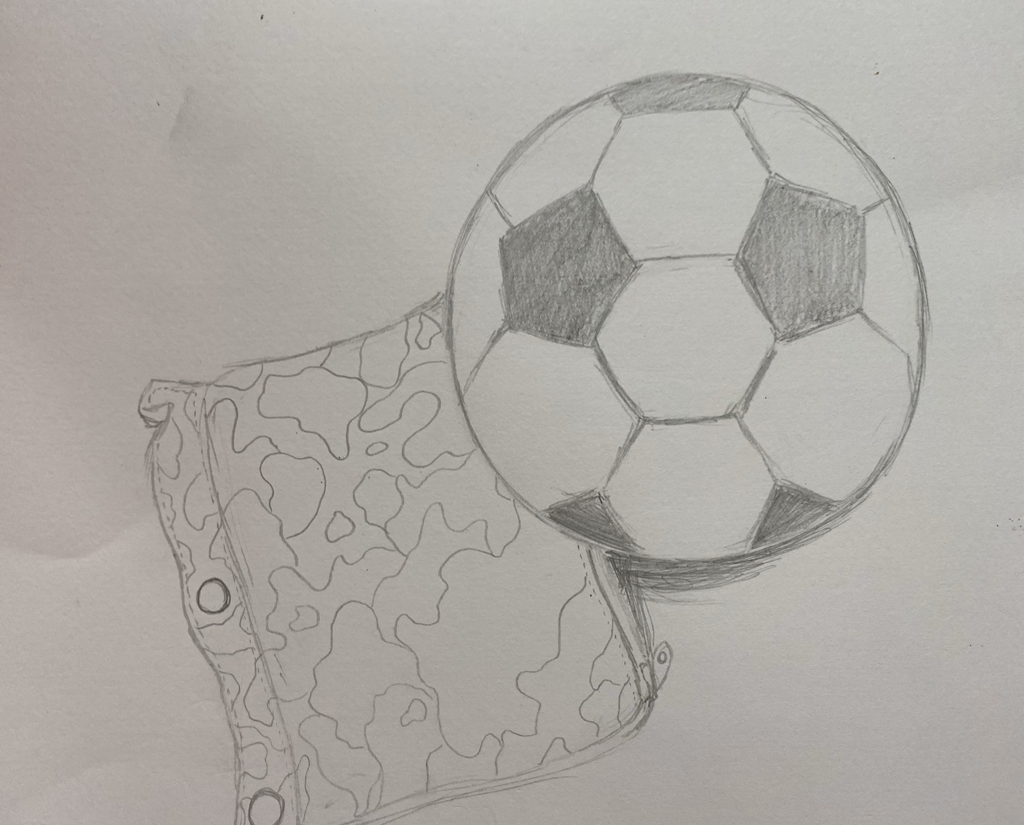
For this we had to draw a picture of the items on our table. We had a soccer ball and a pencil pouch. It was hard to draw the soccer ball due to the shapes on it, while the camouflage on the pouch was easy. This was hard to draw from perspective.
Lego sketch
This is my drawing of a lego model we made. It was hard to get all of the perspectives with the vanishing points. It’s hard for me to draw items from different perspectives, especially legos.
Drawing videos
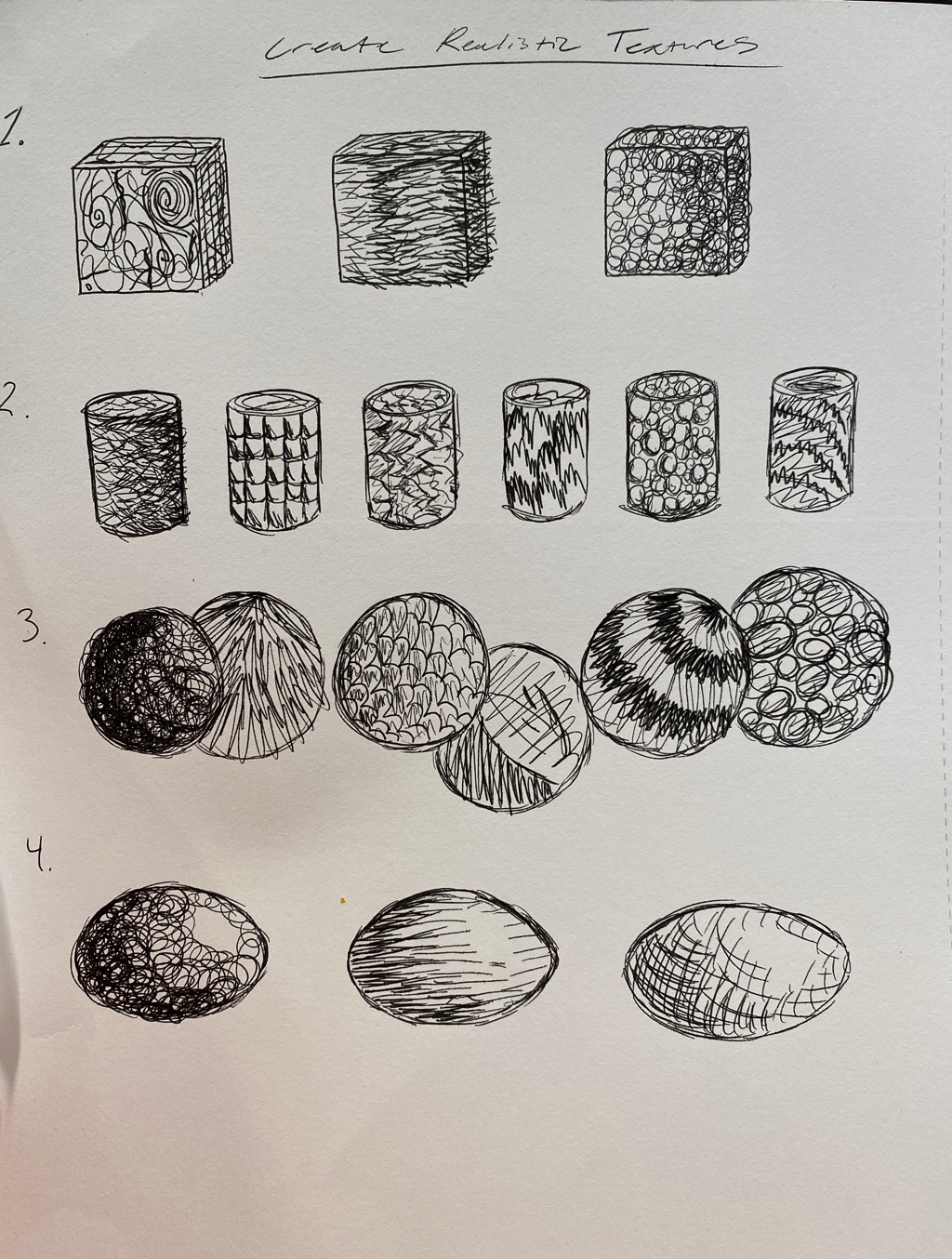
For these videos we had to draw many textures on different shapes. My favorite to draw were the cubes. They were also the easiest. The cylinder was the hardest for me, the textures were a lot more difficult. The spheres were also fun to draw.
Pen STIPPLING
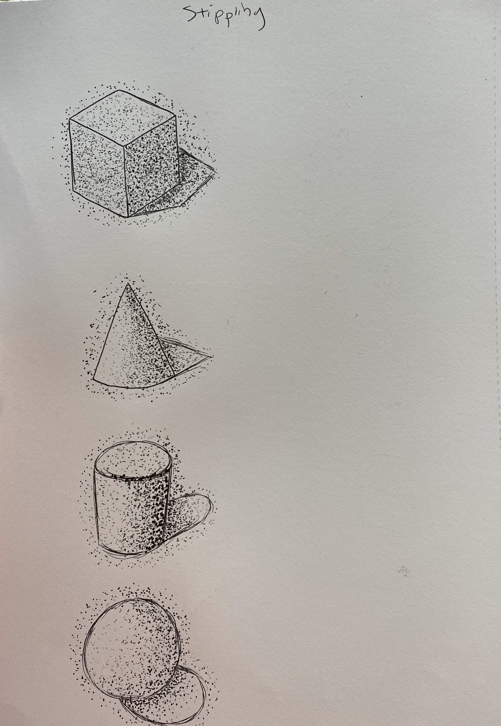
Stippling is my least favorite pen technique to do. It is very tedious. It is also hard to make sure you don’t draw tails on the dots. Eventually it makes your hand cramp which is why I will not be using this technique again.
Compositional sKetches for pen and Ink
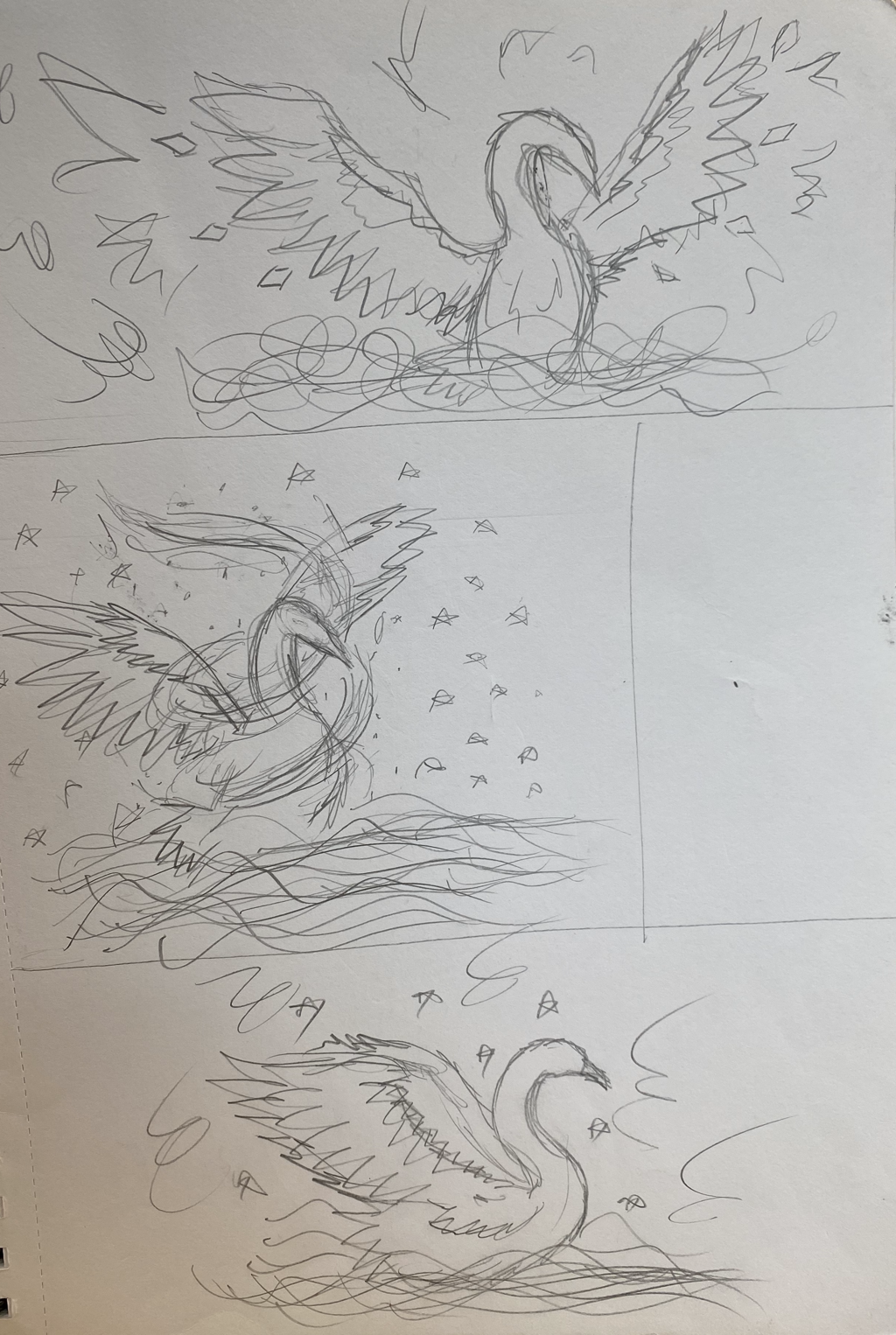
Here are my compositional sketches for The Ugly Duckling. This is the part where the ugly duckling turns into a beautiful swan. I drew the swan with spirals going around it’s wings to show he is changing. I made the wings go out on each drawing to give it a more powerful feel, so far the second one is my favorite. The angle allows in my opinion looks the best.
Pen and ink final
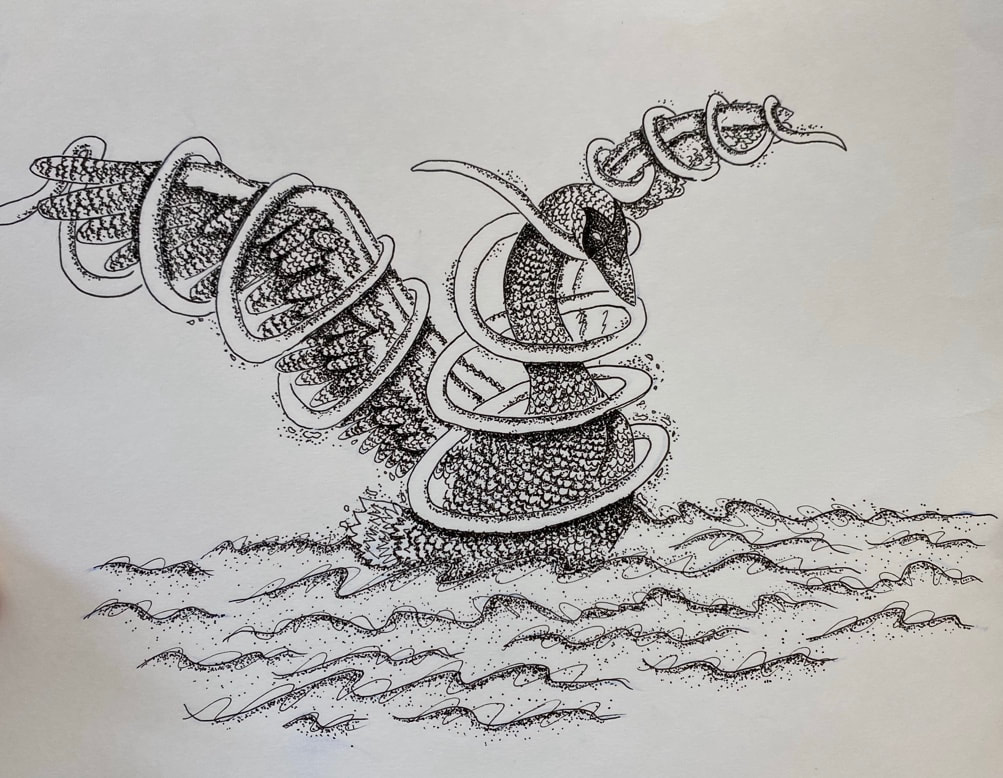
1. I used stippling the most for this project. Stippling allowed me to add darker values in an easy way. It makes the wings pop. I also added random patterns and stippling to the waves to give them movement.
2. I used perspective by making the swan face slightly to the right, but you can still see most of its front. I used the perspective to make it seem like the swan is swimming. Perspective is important because it allows you to be creative with your art, instead of having a boring piece that only faces a certain direction.
3. Texture is very important in this piece. I added feathers and used stippling on them to make it seem more realistic. The shadows I used with the stippling makes the feathers pop out more.
4. Value is also very important for this project. Without value, the swan doesn’t look as realistic and it makes the artwork boring. I want the swan to have a lot of detail, and adding lighter and darker values helps me to achieve that.
5.This project is decently crafted. It could definitely use some work. For example I need to work on taking up more space, and using cleaner lines. I think I did a good job on shading and most details.
6. If I could recreate my piece I would do many things. I would first fill up more space in the background. I would also change the spirals around the swan to make it neater. I would also use smoother lines, and maybe add some more pen techniques like hatching.
7. I recreated the fable The Ugly Duckling. These scene is supposed to capture when he transitions to a beautiful swan. That is why I added spirals around the wings, to show that he is transitioning.
8. It’s important to make sure you understand the concepts taught in class because if you don’t you would be using the wrong technique. If you use the wrong technique, your work will be sloppy. It’s very important that you pay attention.
9. I think this will help me with future projects because I am now more comfortable with pen techniques. I was always familiar with them but never used them in my work. It was fun trying something new.
Prisma color cupCake
For this mini project I did a Prisma Color drawing of a cupcake. It took a while layering all of the colors in this. I feel like I could’ve done a lot better on this work. The colors I used could’ve been more accurate, and I should’ve added more layers. The bottom of the cupcake also isn’t the right shape. I tried to push the darks to make it seem more realistic, overall I think I did an okay job.
